Construction projects generate a large amount of quality data: nonconformance reports, document submissions, audits, inspections, training records and recurring issues. The challenge is not collecting more numbers. It is presenting the right information clearly enough for project managers, directors and clients to understand it quickly.
A well-designed construction quality dashboard turns that data into a concise monthly overview. It helps the project team see what is improving, what remains open and where attention is needed.
A useful dashboard should make its main message clear in about 20 seconds. If the reader has to study it to understand what is happening, it is too complicated.
What should a construction quality dashboard include?
Every project and client has different reporting requirements, but most useful construction quality dashboards include the following areas.
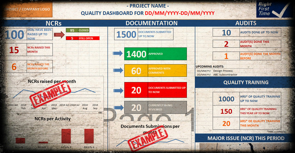
1. Nonconformance reports (NCRs)
Show the total number of NCRs raised, how many have been closed, how many remain open and the trend from one reporting period to the next. Breaking NCRs down by activity or work package can also reveal recurring problems.
2. Document status
Summarise the number of documents submitted, approved, approved with comments and still under review. This gives management a quick view of document-control progress and potential delays.
3. Quality audits
Record audits completed during the month, audits completed to date and upcoming audits. Where useful, add a short summary of significant findings or overdue actions.
4. Quality training
Include training hours or sessions completed during the month and cumulatively. This helps demonstrate how the project is building awareness and competence—not only reacting to defects.
5. Major issues and trends
Highlight the most important quality issue for the reporting period, together with any repeating trend that needs management attention. A dashboard should support decisions, not simply display totals.
Keep the dashboard simple
More data does not automatically produce better reporting. Include only information that helps the reader understand performance, risk or required action. Use consistent colours, clear labels and a limited number of charts.
Where a project already uses a reliable digital quality platform, dashboards can often be generated automatically. Many construction teams, however, still rely on spreadsheets and manually maintained records. In that situation, a practical Excel layout can save time and provide a consistent starting point.
Download the Construction Quality Dashboard Excel template
The Construction Quality Dashboard Template for Excel is a ready-made visual framework for monthly construction quality reporting. It includes example sections for:
- NCR status and monthly trends
- NCRs by activity
- Document submissions and approval status
- Completed and upcoming audits
- Quality training hours
- Major issues for the reporting period
You can edit the headings, figures, colours and project information to suit your organisation, contract and client requirements. A PDF example is also included so you can see how the completed dashboard can look when presented or printed.
Important: This is a manually editable Excel reporting template. It is not an automated data system and does not contain macros or a live connection to project records. It is intended as a practical starting point that you can adapt to your own reporting process.
GET THE CONSTRUCTION QUALITY DASHBOARD →
For teams that also need inspection, NCR, audit and other quality-management documents, the dashboard is included in the 12 Essential Construction Quality Documents Pack.
VIEW THE COMPLETE CONSTRUCTION QUALITY PACK →
Frequently asked questions
Is the dashboard automated?
No. It is an editable Excel layout and reporting framework. You enter or update the relevant project figures manually and adapt the dashboard to your needs.
Can I change the headings and colours?
Yes. The Excel file is editable, so you can add your project or company name and adjust the content and visual presentation.
Which quality KPIs can I report?
The example covers NCRs, document status, audits, quality training and major issues. You can replace or extend these sections with the KPIs required by your project or client.
Is this suitable for every construction project?
It is designed as a flexible starting point. Reporting requirements vary, so the template should always be reviewed and adapted for the contract, organisation and client.